The vibrance and playfulness of the new visuals reinforce the mission of Friends Life Community: to help people with IDD grow and enjoy life in community.
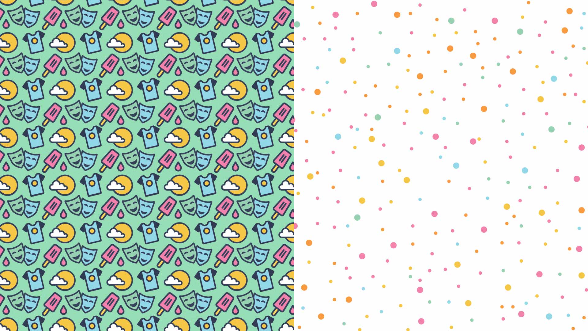
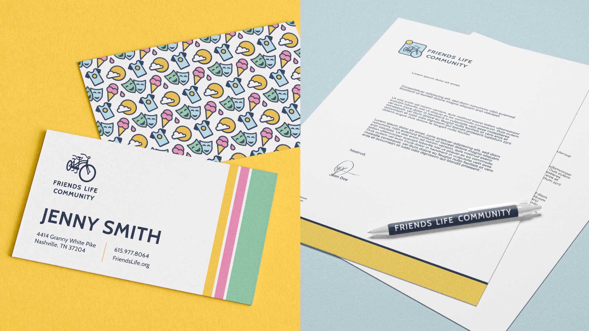
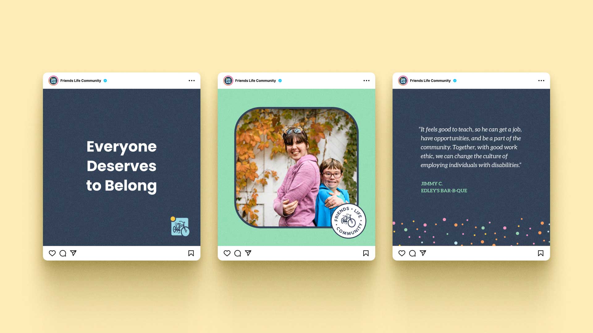


The vibrance and playfulness of the new visuals reinforce the mission of Friends Life Community: to help people with IDD grow and enjoy life in community.


Since 2008, Friends Life Community has provided opportunities, support, and community for teenagers and adults with intellectual and developmental disabilities. Following a successful year in 2020, the organization was ready to optimize its digital platforms to become more accessible and expand to new markets.
FLC partnered with Circa to develop a brand identity that captures the unique joy and focused professionalism of Friends Life Community in order to focus their marketing efforts. With a clear brand and focused marketing, Friends Life Community’s voice of empowerment better supports employees, friends, volunteers, and partners.
Through a Discovery and Audit process, Circa identified three key areas to help Friends Life Community reach its goals. This involved revitalizing FLC’s brand core, refreshing its website, and strategizing around FLC’s upcoming campaigns. With fresh messaging and creative visuals, Circa brought together the many disparate parts and programs into a cohesive and impactful whole that not only communicated the value, goals, and heart of FLC, but also wowed the community and inspired new partnerships to drive expansion.
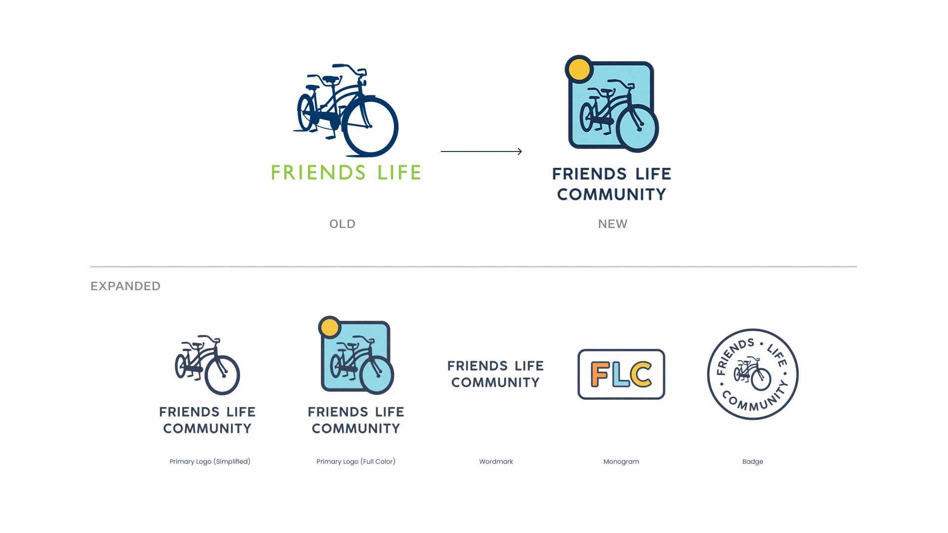
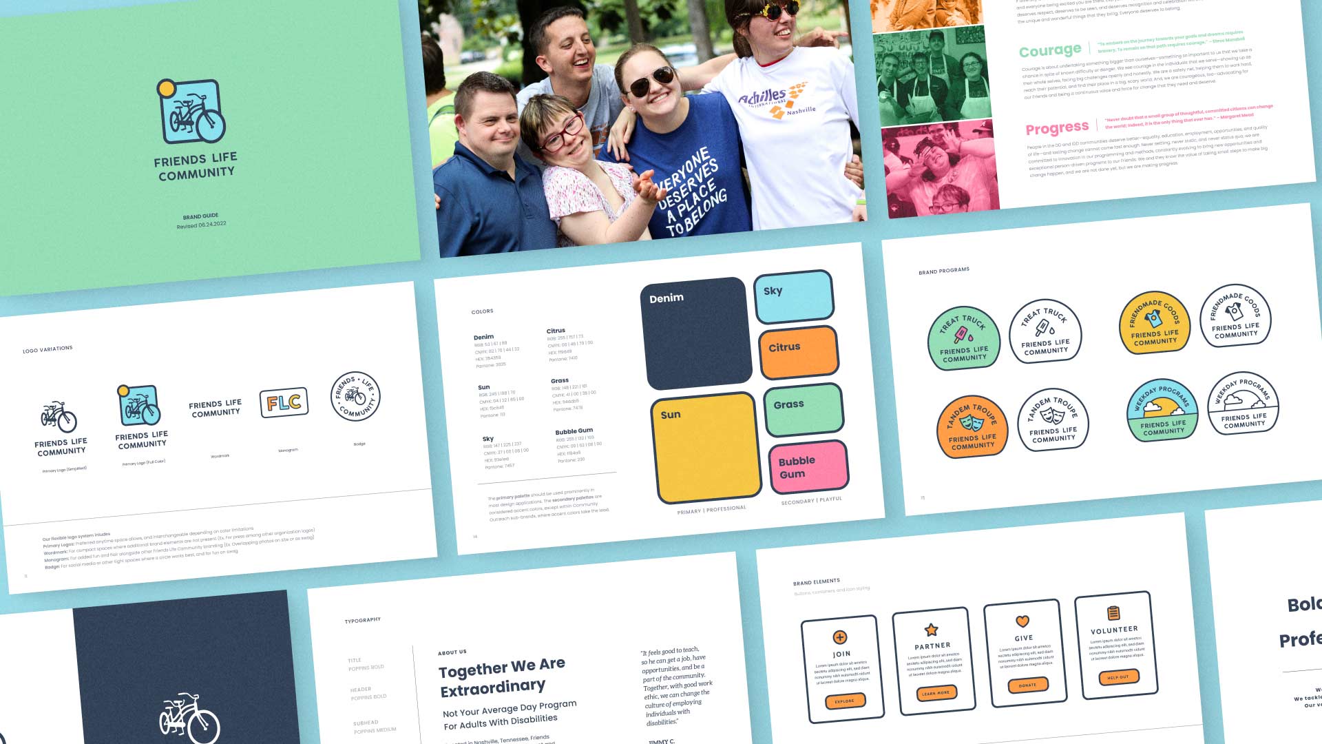
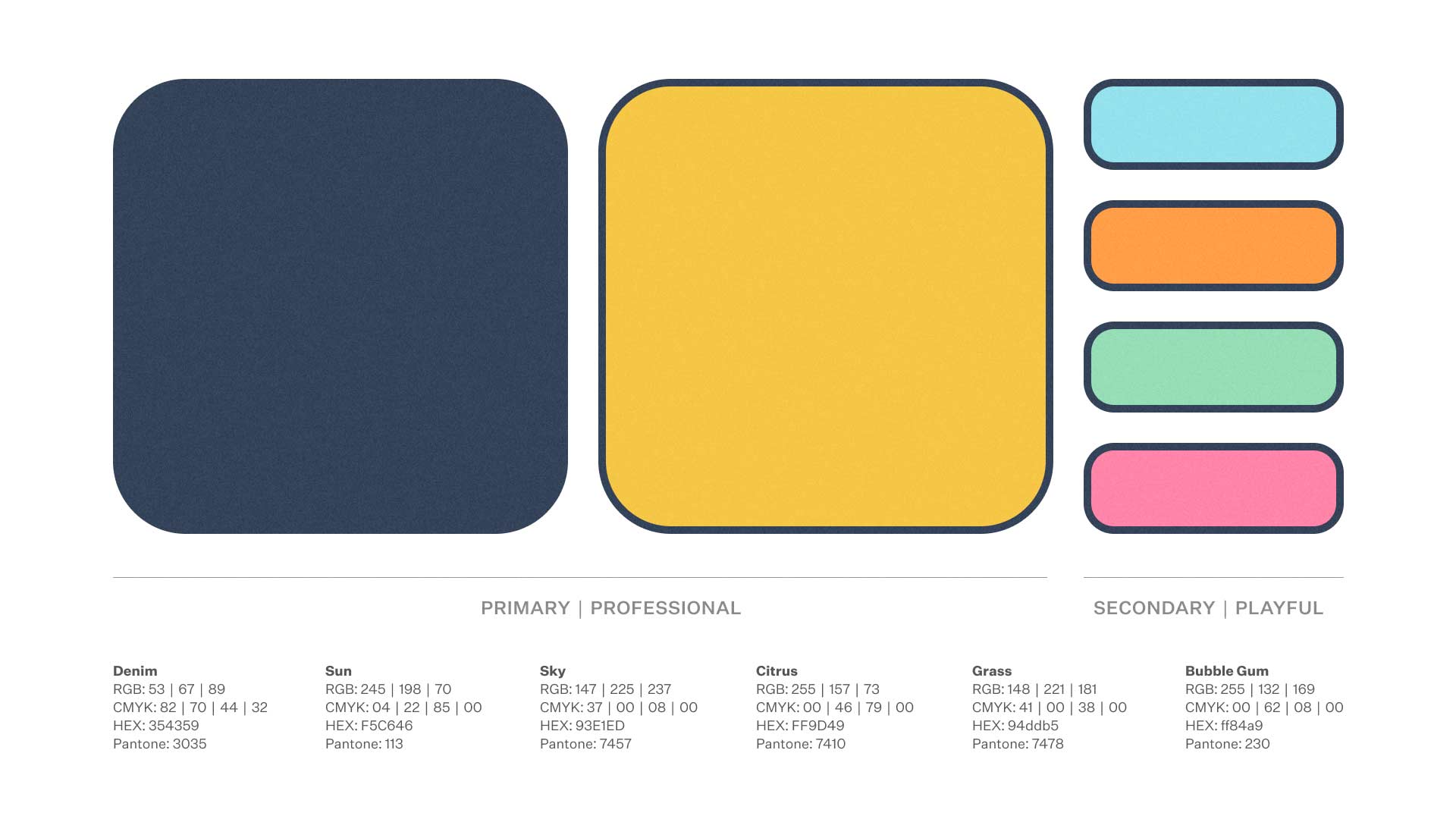
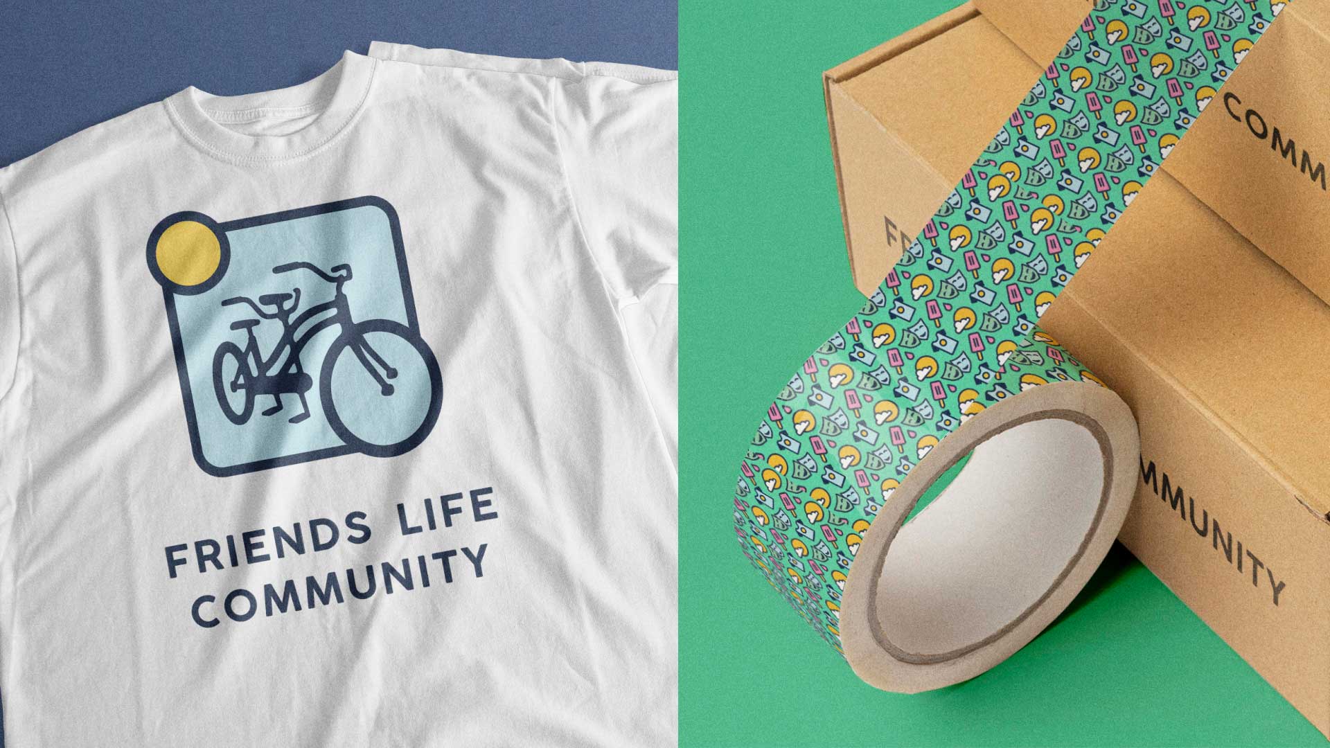
Brand Refresh | Many behavioral health organizations can feel clinical. It was important that the FLC brand felt close, supportive, and reflective of an organization that authentically cares about the community it fosters. Using a vibrant color palette, and contemporary playful graphics and patterns, the Friend Life Brand expresses a balance of joy and professionalism.
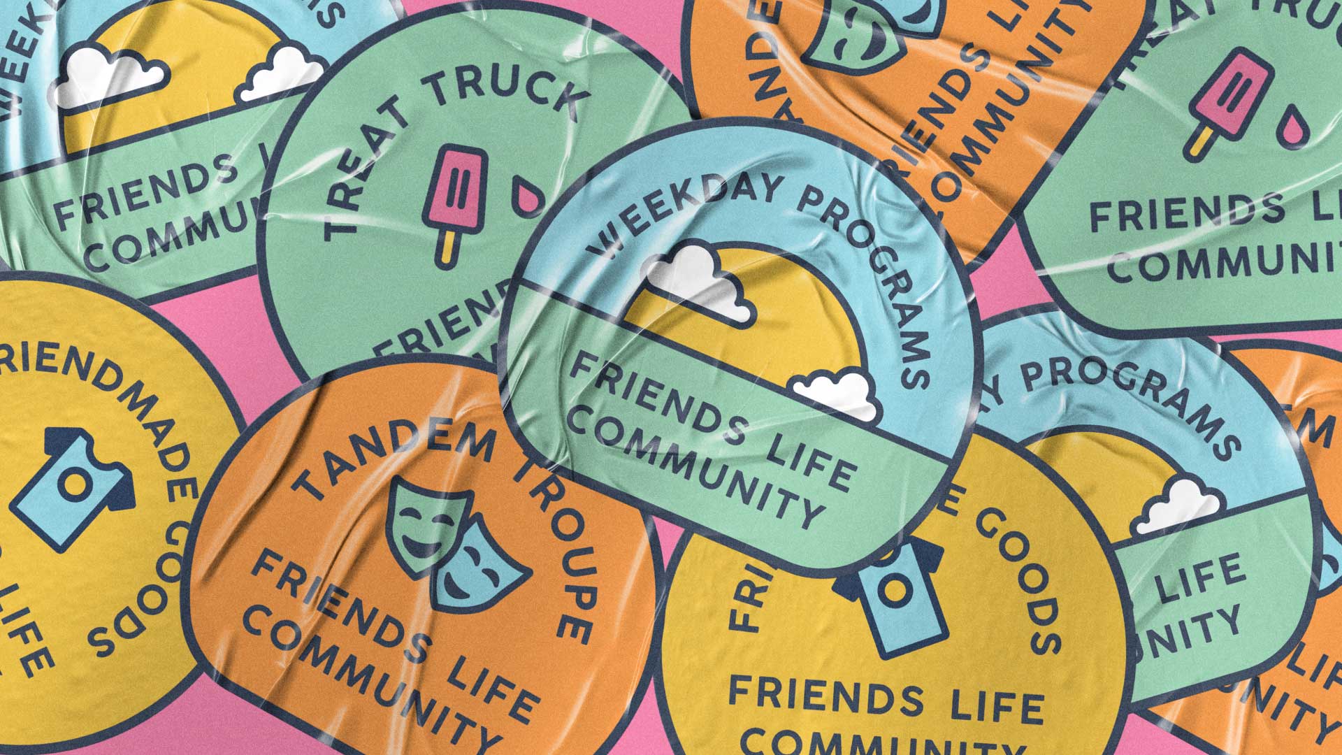
Brand Hierarchy | The Friends Life Community sub-brands were given unique personalities that aligned beneath the FLC umbrella brand. Tandem Troupe, Friend’s Life’s theater and performance branch, was outfitted with a bright orange accent color and sub-brand logo featuring classical theatric masks. Friend Made Goods, the business and art branch of FLC was given a bright yellow logo that pops when placed beside other products, along with strategic sales messaging recommendations. Custom fonts and mint green graphics were used for the Friend Life Treat Truck, one of Nashville’s favorite food trucks.
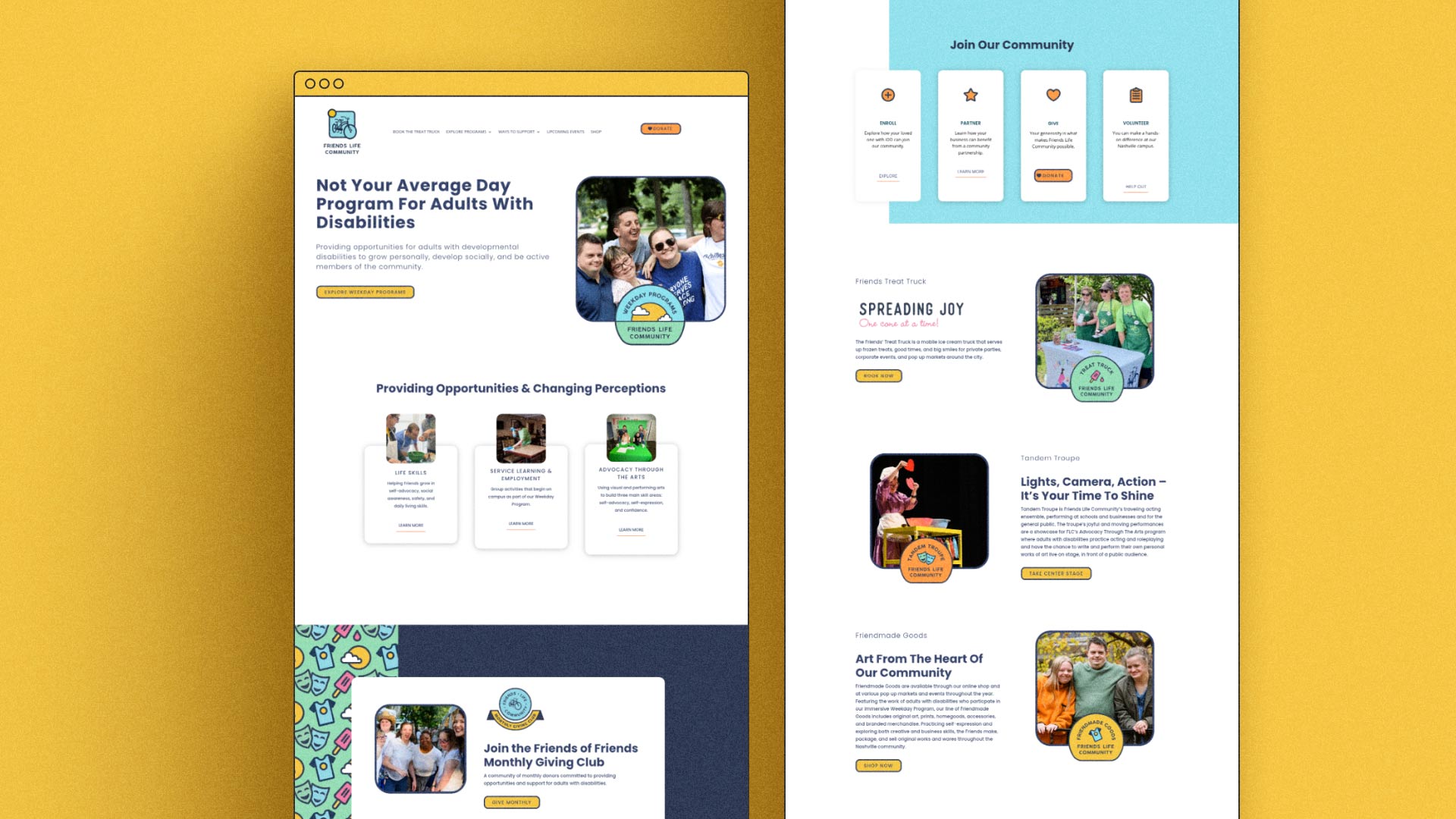
Website Refresh | The new website focused on a clear customer journey and brand cohesion for Friends Life. The updated platform includes a strategic and streamlined navigation system, allowing seamless exploration. By incorporating the new brand assets, visuals, and messaging, the website reflects the heart of Friends Life—balancing the unique joy of Friends Life with professionalism.